How does this method work?
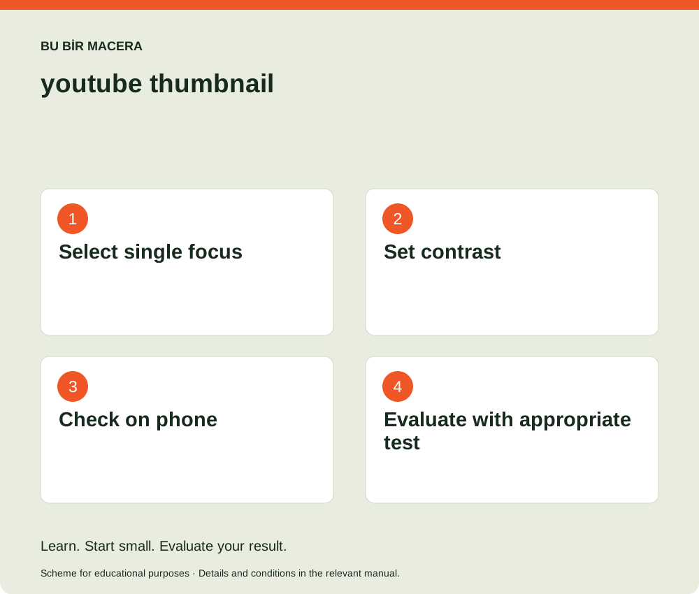
The thumbnail should convey the main idea of the video in a narrow space. Instead of putting each scene in one image, choose a focus: person, product, place, or an obvious comparison. Overlaying text on a face or important object weakens readability and emotion. If text is necessary, keep it short; Rewriting the entire video title onto the image.
Evaluation with a concrete example
In a route video, a clear path, human scale and a single element of curiosity may be more understandable rather than a crowded collage. Fine lines and small text that look beautiful on the desktop may disappear on the phone. Preview the image in a small size. Expecting a click by using an event that hasn't happened, overly altered danger, or a person who isn't in the video undermines viewer trust.
Your first application: what should you have?
Design two or three covers for the same video with different focus; Have one main message in each. If the platform's testing tool is available on your channel, use its official stream and evaluate the result with sufficient data. Consider the viewer's rapport with the content, not just clicks. The output is an image that is understandable on the small screen, has clean rights, and is consistent with the promise of the video.